System Diagrams
-
 Price range: $25.00 through $80.00
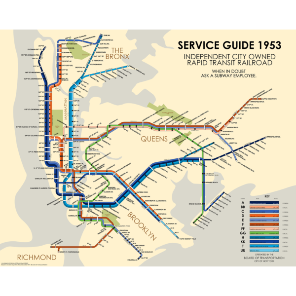
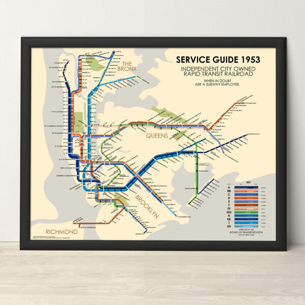
A fictitious service guide of the IND division, New York Subway, had the 1939 Second System plans been built after World War 2. This service diagram is based off of the original Board of Transportation map of 1937 showing the new IND 8th Ave Lines, and the modern update done by Chris Neuherz.
The map is printed at 16″x20″ on Satin finish 80# cover stock – 220 GSM. Made in the USA! Standard production time is 5 Days. Please add more time for shipping.
Select options This product has multiple variants. The options may be chosen on the product page -
 Price range: $30.00 through $80.00
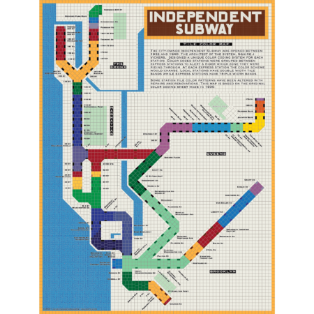
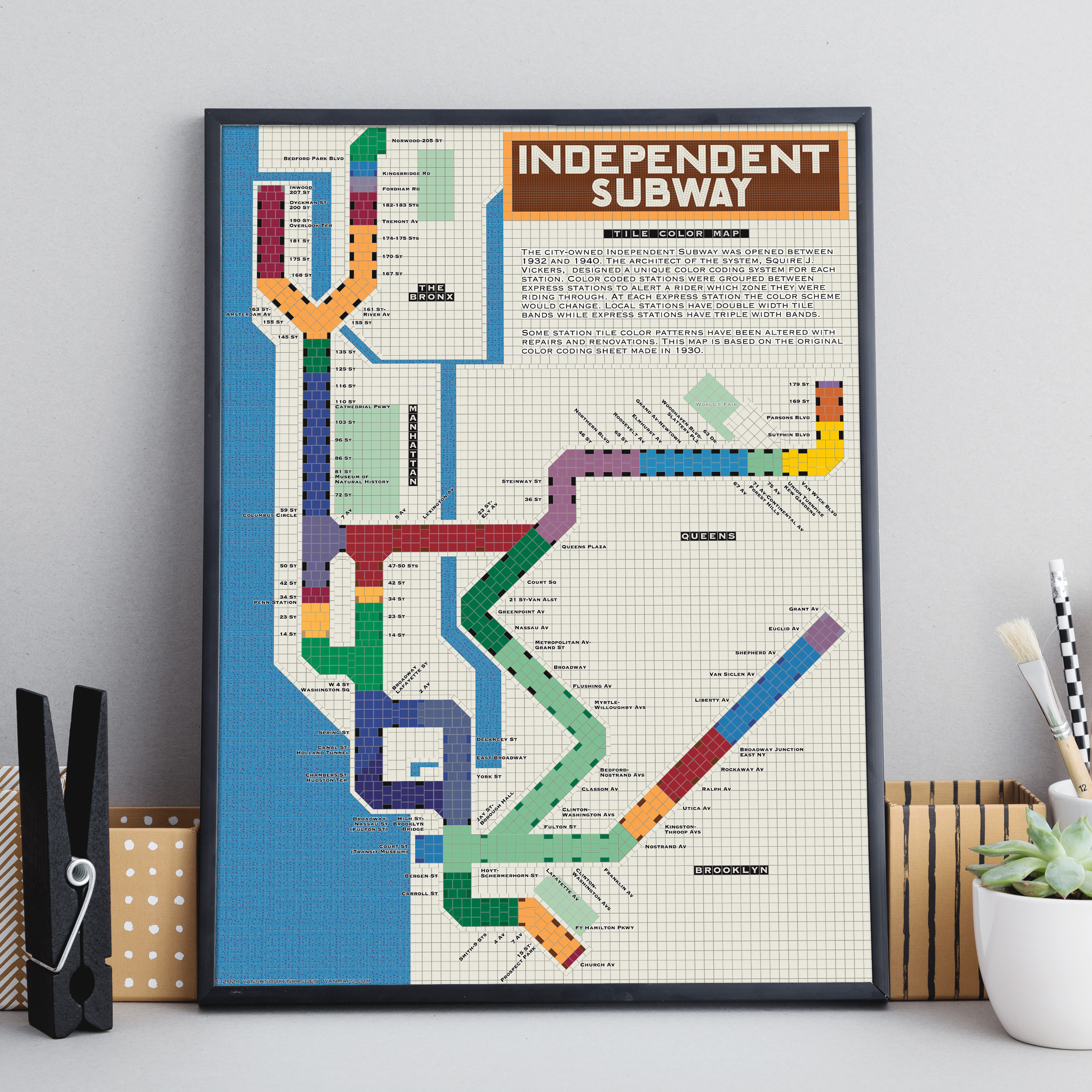
The City of New York built Independent Subway (A/B/C/D/E/F/G trains) was opened between 1932 and 1940. All the subway stations at the time featured tile bands and art unique to each station. The IND’s architect, Squire Vickers, created a new tile pattern based on color theory. He grouped express and local stations with color so that each time a rider rode through an express station the color of the tiles would change. He created a modern, streamlined design which featured two colors per station. The idea was that a rider would recognize their station’s color and know when to get off. This map shows how each color group looks when laid out like a subway map.
Note: The design features an orange tile outline. Some frames may obscure this outline.
Printed on Satin finish 80# cover stock – 220 GSM, 18″ x 24″.
Select options This product has multiple variants. The options may be chosen on the product page